In my previous post How to do BAS Graphics Right: Part I, I wrote about the 5 basic rules to BAS graphics I learned during my years as a controls system master integrator. If you’ve not read that post yet, I’d encourage you to go back and give a glance as it’ll put the rules below into perspective, and feel free to ask a question if you got one using the comment section at the bottom of the post. Here’s a quick recap of the rules:
- Rule 1: The graphic should clearly reflect the sequence of operations.
- Rule 2: A controlling variable should always be placed adjacent its set-point.
- Rule 3: On screen point names should be verbose and make sense based on the sequence of operations.
- Rule 4: Schematics matter; graphic images don’t.
- Rule 5: Animation should always be based on feedback.
In this post I’m going to recreate a graphic screen I’ve seen from a job recently. I am reconstructing the graphic for the purpose of anonymity. Protecting the identity of these graphic screens is important because I was not the design engineer on these projects and therefore didn’t instruct the contractors on what they were to provide. Industry professionals have varying opinions on graphics. As a commissioning agent I’ll provide feedback, but it’s usually after the graphics are generated and there’s added cost to make them better than their contractual obligation. My hope is that if you’re reading this post and you’re a controls contractor, you’ll adopt the rules laid out here, and maybe even improve upon them.
Before I begin with examples, I’d like to say that controls contractors don’t have an easy job. They’re the last on site, and they depend on both the mechanical and electrical contractors to finish on time so that they can get started. In most cases the construction schedule is delayed or pushed back which shrinks the amount of time available for a BAS contractor to install their product, program, test, and commission. Not to mention their product is usually one of the most customized, nuanced, and complicated part of the building since it ties many systems together and is largely responsible for comfort and energy consumption. So, with all that said, it makes sense that graphics may be the last thing on a contractor’s mind when they’re trying to get a building working.
That all being said, they could always create a large standardized graphic that covers most scenarios, and then copy/paste and modify to fit the job. Their starting template can be of a higher caliber which would save them time in the field and still meet all the criteria I am about to point out. It is always easier to delete something you don’t need than to create it in the field on demand under a time-crunch.
Example: AHU
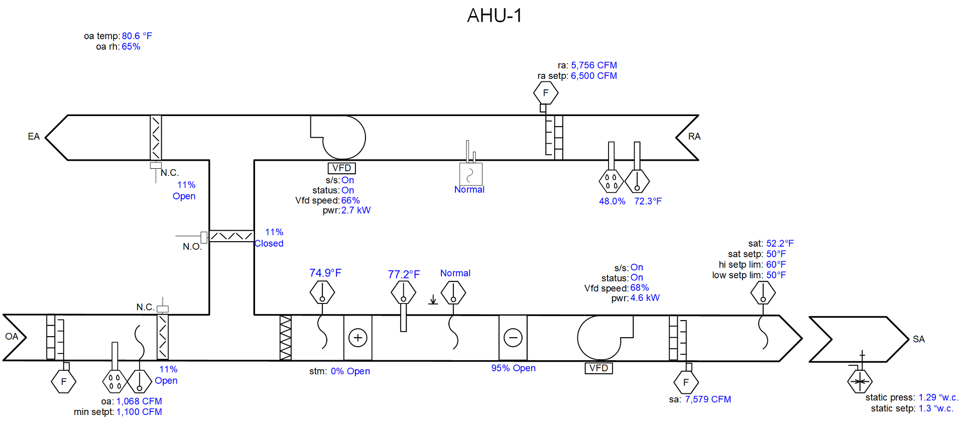
Figure 1 - Real World AHU Graphic with identity removed (1920 x 840 resolution)
This is what I would call an industry standard graphic but keep in mind there are no industry standards on this that I am aware of (as of Sept. 2020). Again, I’ve recreated the graphic to hide the identity of both where AHU-1 is and the contractor that developed the graphic. This graphic is web-based and auto-resizing via the product it was created on, yet there is so much blank space. Let’s look at the score card:
- ☒Rule 1: The graphic should clearly reflect the sequence of operations.
- ☑Rule 2: A controlling variable should always be placed adjacent its set-point.
- ☒Rule 3: On screen point names should be verbose and make sense based on the sequence of operations.
- ☐Rule 4: Schematics matter; graphic images don’t.
- ☑Rule 5: Animation should always be based on feedback.
This is not to scale with the original but is close. Looking at this graphic and thinking about Rule 1, I can infer some of the sequence. I know that the supply air is reset, but I don’t know what controls the reset. I know the limits of the reset, which is nice (and they’re adjustable). I also know that there’s an airflow station controlling the outdoor air and I assume it’s controlled to minimum CFM. I don’t know which points are adjustable and which ones are not since they used the same color for every data point. They did keep most of the major set-points adjacent their controlling variables. They did not use verbose names. The schematic is accurate, but the values are removed from it so the schematic doesn’t provide much added value. Although they did have nice 3d graphic images, it doesn’t help make the relationships between each component in the air stream easy to see. Because of that I will neither ☒ or ☑ Rule 4 on the score card. All their animations were based on feedback (from what I could tell).
If I were to examine the sequence of operations for this unit and build the graphic over based on the ruleset it would look like this:
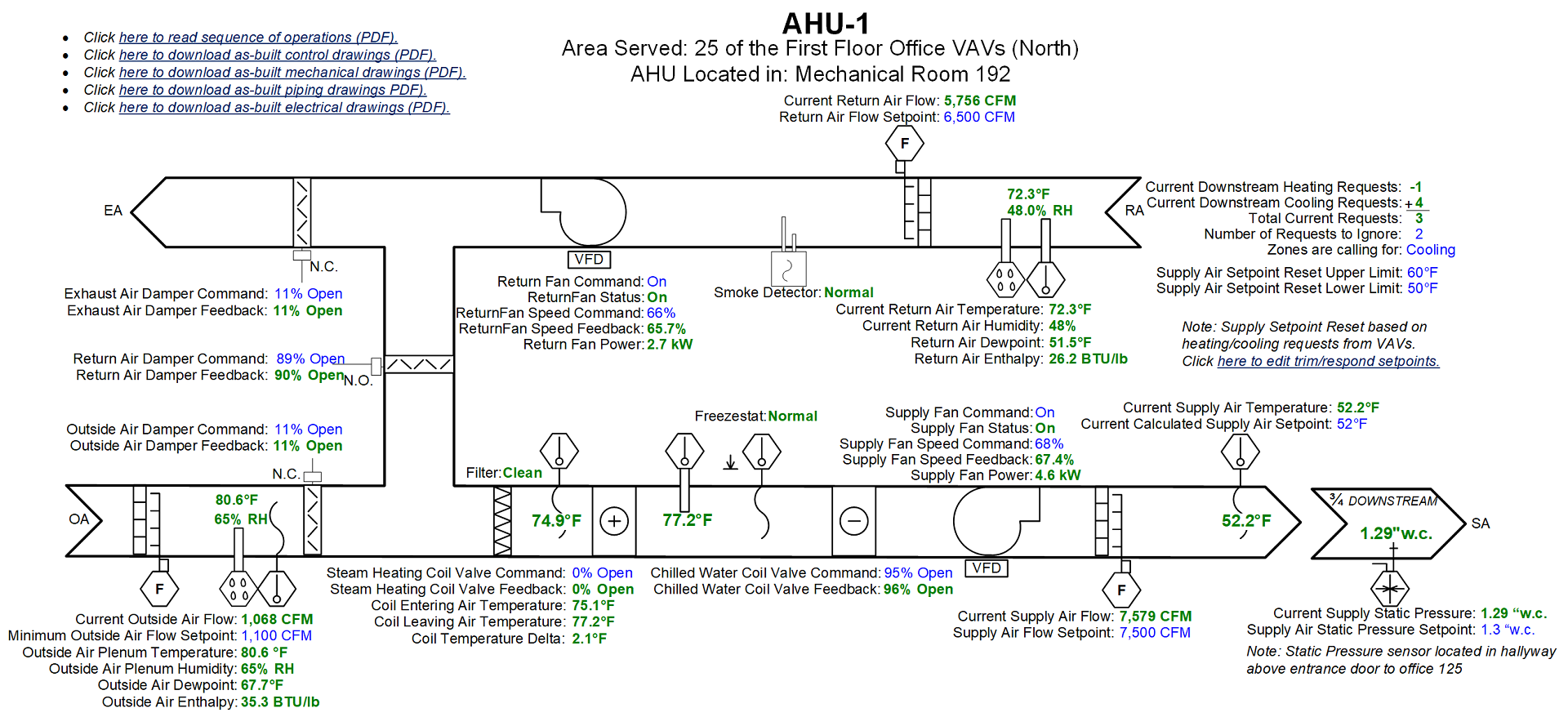
Figure 2 - Real World AHU Graphic with identity removed, modified per the rules (1920 x 840 resolution)
- ☑Rule 1: The graphic should clearly reflect the sequence of operations.
- ☑Rule 2: A controlling variable should always be placed adjacent its setpoint.
- ☑Rule 3: On screen point names should be verbose and make sense based on the sequence of operations.
- ☑Rule 4: Schematics matter; graphic images don’t.
- ☑Rule 5: Animation should always be based on feedback.
This graphic has a 1080p resolution (1920 x 1080 pixels), and I kept it there to show what the difference is when you utilize the available space. I’ve added copies of the data points overlaid on the duct schematic. This allows a user to see the changes in temperature made by the mechanical equipment schematically, which helps adhere to rule #4.
I’ve also increased the number of set-points shown on the graphic which helps conform to Rule 1. Not only does the new graphic provide a link to the sequence of operations, but it also allows the user to download PDF copies of the various as-built documentation. Every control system out there should have this capability in 2020, and if you’re told yours doesn’t it might be time to start saving for an upgrade.
The graphic now contains more verbose variable names following rule #3 every data point is easier to understand. In this AHU, every actuator has feedback as part of the specification (as it turns out), but not every point was shown on the graphic. I suspect it was because this contractor ran out of time, and feedback wasn’t a priority at the time the graphic was programmed. It’s also probably not part of their template, so its extra work to add those points. Another big difference in reflecting the sequence is that the colors for read only points are now differentiated from set-points or parameters. This gives a visual clue to the user allowing them to see what the system is measuring vs what is adjustable and is helpful in identifying problems with the mechanical equipment.
There are added informational notes providing physical locations of both the AHU, but also the static pressure sensor. This little note saves a lot of time when a sensor goes bad and needs replacement. There is also an added hyperlink in a note to take the user to another screen of set-points. This makes sense because the screen is already crowded. The programmer chose to put any set-points on the primary graphic related to the primary control sequences, meaning anything that affects a physical output (i.e. temperature or pressure). Any set-points that correlate to timing and tuning were placed on a secondary screen. They’re less likely to be adjusted once the system is properly tuned.
The outside air temperature is measured at the OA intake on this unit, so it was moved to that section of the schematic. A bonus of any control system is to be able to use temp and humidity to calculate dew point and enthalpy; why not show it as a matter of course, especially with units that can economize.
Sure, the graphic looks more crowded now, but the space on screen is utilized to provide more context and data that will be helpful when troubleshooting needs to occur. The variables are no longer cryptic, and the adjustability of the unit’s set-points is clear. The set-point names and variable names allow you to infer the sequence at a glance, but if you need to be sure you can open the sequence PDF in a new browser tab and check for yourself.
Going Above and Beyond
There are other rules that I didn’t mention about graphics in my previous post because they’re focused on trend data.
- Rule 6: Trend everything, keep data forever (storage is cheap, data is priceless).
- Rule 7: Preconfigure trend charts to show the primary CVs and their set points together for either the last 7 days or the last 24 hours pending the user/systems.
On Rule 6, a trended data point on a very popular building automation product (that I’ll keep anonymous; you know who you are) has that each trended data point consumed 48bytes of memory with an additional 10 bytes per trend sample. So, a point with 2x samples is then 68 bytes, 3x samples 78 bytes, and so on.
As of the writing of this post (late summer 2020), the average cost of a 4-terabyte hard drive is $100. Let’s break that down to bytes to figure out the number of samples:
|
Terabytes |
Gigabytes |
Megabytes |
Kilobytes |
Bytes |
|
4 |
4,000 |
4,000,000 |
4,000,000,000 |
4,000,000,000,000 |
If I had 13,000 data points on a server (a campus sized BAS), I could store every data point at 15 min intervals for 58 years for that $100 hard drive. Don’t believe me, check my math:
- bytes of overhead to get started for each point.
- That leaves us with 3,999,999,376,000 bytes for samples OR
- 3,999,999,376,000 / 10 = 399,999,937,600 samples possible, assuming even 15 min. sampling on each point[1]
- 399,999,937,600 samples / 13,000 data points = 30,769,226 samples per point
- 30,769,226 samples per point / 15 mins = 2,051,282 = 21,367 days OR rather 58 years of data
Rule 7 is just common sense; however, you’d be surprised how often commissioning agents have to enforce it. I see supply air temperature trended with valves all the time but with no set-point. This type of chart provides some information but no context. Without the controlling set-point next to the controlling variable on any trend chart, its impossible to tell if the equipment is behaving properly at a glance.
Conclusion
Programming BAS systems is a complicated job that is mostly done under unreasonable deadlines. So programmers first prioritize getting the HVAC equipment functional, then they work on graphics to make it accessible. Often, the graphics are the last thought and therefore they suffer. If companies standardized on the most complicated version of their graphics as a template, the programmer would simply need to delete points that don’t apply. In programming, I have found its often easier to delete what you don’t need rather than add what you do need on the spot and get it right. Also, keep in mind, we are entering the age of 4k resolution as a standard. Meaning graphics have more on-screen real estate than ever! Why is our industry not utilizing that real estate?
If you have any comments or questions on this blog post, please input them below. I’d love to get your feedback. If you’d like a review of your graphics by Cx Associates, feel free to reach out!
[1] This is over estimated since some points could be recorded on change of value shrinking their memory footprint.