Over the course of my career I have evaluated BAS graphics packages as a function of my daily 9 – 5. I have been doing this since 2002 and in those days, most BAS manufacturers barely had functioning websites. However, the products they sold allowed their vendor networks to create Human Machine Interfaces (HMI) and Graphical User Interfaces (GUI), and these interfaces haven’t really functionally changed a whole lot since those days of pre-broadband internet and before the smartphone was commonplace. Given that we may be stuck with outdated user interfaces for some time to come, it makes it all the more important that proper care is given to how the information is displayed and to ensure users can easily absorb the information they need from the BAS.
Often left as an afterthought, BAS graphics are actually extremely important. A good BAS graphic can save energy in a building by providing actionable information for the maintenance personnel. A poor BAS graphic can hide energy draining problems and lead to years of higher utility bills. As a BAS programmer I was taught some basic rules about putting together a BAS graphic early in my career. After reviewing the work of dozens of BAS contractors through my work as a commissioning agent, in my experience these rules seemingly are not taught openly among BAS contractors. Below, I’ve outlined a few of the most important rules I learned early in my career that I find to still be valuable. Feel free to take them, improve upon them, make them your own.

Rule #1: The graphic should clearly reflect the sequence of operations
A user should never look at a BAS graphic and say, “huh, why is that equipment doing X Y or Z?” A BAS graphic should be planned as soon as a controls programmer starts reading a sequence of operations. Whenever a programmer reads something to the effect of “Maintain temperature at setpoint” they should instinctually know that there are now (2x) data points that need to go on that graphic: A temperature data point, and a setpoint.
If possible, the BAS graphic should contain embedded on it (either on a separate page or as a link) the original sequence to the piece of equipment being viewed.
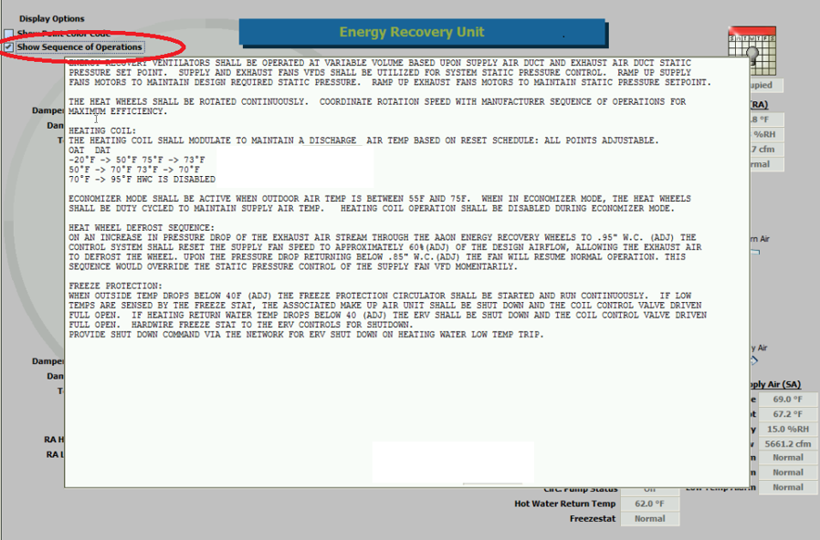
Figure 1 - In this system the sequences can be hidden/shown on the graphics page
I almost never see this, although almost all BAS graphic systems I encounter can provide this information relatively easily.

Rule #2: A controlling variable should always be placed adjacent its setpoint.
A controlling variable (CV), or a variable/input to a control program that affects the control outputs, should always be contextualized on a graphic by its setpoint. If a graphic is made where the setpoint is not adjacent to its CV, the user will have to search the graphic to make sense of the CV. If something is wrong with a piece of equipment it won’t be as obvious to the user. By following this rule, you will also be adhering to Rule #1!

Consider this: would you ever buy a thermostat for your house if it didn’t show either the setpoint or the current temperature? Then why would you sell a customer a graphic that doesn’t show the setpoint next to the controlling variable? It happens all the time on BAS graphics!
| Setpoint is 75, current temp is 78 – right next to each other, gives the user an idea of how far off the control is. |
Setpoint is 75, current temp is “I dunno”. So, am I at setpoint? Am I far off setpoint? Nobody wants this. |
 |
 |
Rule #3: On screen point names should be verbose and make sense based on the sequence of operations.
Long gone are the days of 8- and 16-bit computer limitations. Graphics no longer are DOS based (yes, I am old enough in the industry to have worked on DOS based graphics, and no, it was not great). The industry is now mostly web-based (if you’re not on a web-based system, you’re falling behind). Most modern PCs use 1080p resolutions (1920 x 1080 pixels) and most modern browsers can scale their BAS graphics. There is no need to shorten variable names beyond the expectation of industry standards. I recommend any controls company standardize their point layouts and naming based on ASHRAE Guideline 36-2018 (it’s worth the $94).
In the example below, the controls contractor used abbreviations for “pressure,” “return air,” etc. However, look at how much blank grey space is available spell everything out! There wasn’t a good reason to shorten any of the variable names below.
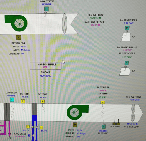
Nobody talks like this:

Rule #4: Schematics Matter; Graphic Images Don’t
The graphic should be schematically accurate with respect to air/water flow. The unit graphic images don’t matter if they’re representative of the equipment they represent. While having nice 3D renderings of HVAC equipment really adds polish to your graphic, if the information isn’t schematically accurate it’s like having a Rolex that doesn’t tell time. Sure, it looks nice, but it doesn’t really serve its purpose.
The graphic must show temperatures and pressure relationships as sensed by the sensors with respect to the medium under control (air/water). If a sensor is misplaced on a graphic, it can lead to bad decision making / poor troubleshooting and wasted time or energy. Sensor values should be clearly labeled, and if there is enough space, they should be placed on a schematically accurate representation of the equipment in the correct order with respect to flow. This way the user has a graphic showing the equipment’s manipulation of air/water as the fluid moves through the system.
Rule #5: Animation should always be based on feedback.
Animations are very helpful for being able to quickly look at a graphic and understand what’s happening. They save time! However, animations should always be based on sensed feedback and never on a command. For example, if you have a networked thermostat controlling a fan coil unit, and the thermostat doesn’t provide feedback, do not animate the fan on the graphic based on the thermostat output. Command-based animations can give the impression that a piece of equipment is running even when it may be failed. This can delay troubleshooting and can result in higher energy consumption due to maintenance inaction.
If the customer asks for the animation with their new control system, use that opportunity to show them the value of additional low-cost current sensors which enable animation and alarming. Adding these low-cost sensors will add historical trend data enabling efficient diagnostic and repair when equipment fails or malfunctions. With these sensors they get not only the graphic animation, but all the benefits of measuring equipment behavior and performance. You can never have too many sensors, but you can certainly have too few!
These rules have helped me in the past put together very informative graphics that have saved me as a former controls programmer from taking the blame for mechanical faults or poor sequences. Given the rules above, I will reiterate the first one: The graphic should clearly reflect the sequence of operations. Given rule one, let me give you an example:
Sequence informed graphics
Creating high-quality sequence-based graphics can get very tedious as you start reading good controls sequences of operations, which can contain a high number of specifically named control parameters. Let me give you an example using an industry standard controls sequence:
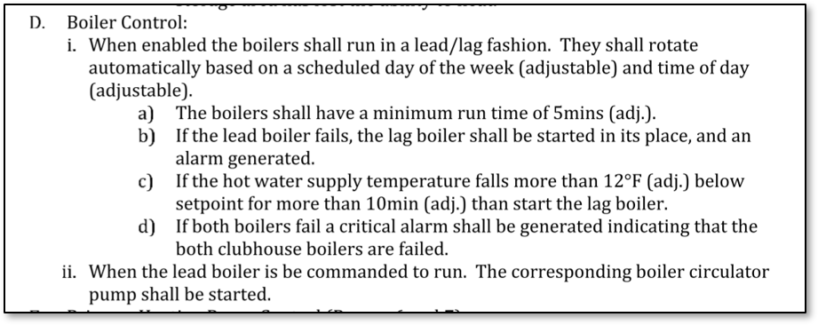
Figure 2 - Example Sequence of Operations
The sequence of operations shown above is a pretty status quo sequence for boiler lead/lag control. If I was the programmer reading this sequence, I would look for the control points listed in the table below to be graphically represented and I would make sure they were all in the control program. If they were not included in the price, I would notify the owner / commissioning agent to see if they’d be willing to add them (as they provide great value).
| Point from Sequence to be Displayed on Graphic |
Description of point's purpose, and why it should be on the graphic (Why on Graphic = WOG) |
|
1) Boiler system enable/disable |
Point indicating whether boiler system as a whole is enabled. WOG: If you look at the screen and see both boilers off, system may be disabled for some automatic reason (seasonal response) or for maintenance |
|
2) Rotate day of the week |
Point indicating what day of the week the boilers will rotate the next Lag in as Lead WOG: Not only is this called for in the sequence, but also knowing when a boiler/pump/etc. will rotate can help failed equipment to present the failure within business hours, preferably after maintenance's morning break. |
|
3) Rotate time of day |
Point(s) indicating what time of day, on the set weekday the rotation will occur. WOG: same as Rotate day of the week |
|
4) Boiler minimum Runtime |
Minimum amount of time boiler will be commanded on WOG: Called to be adjustable from the sequence, it also can help set expectations of how often a facility user should see a boiler’s on/off cycle. |
|
5) Current lead boiler |
This point indicates which boiler is currently the lead boiler. Should display the boiler’s name as a string of text. WOG: This is important to indicate graphically because the user should be able to look at the graphic and immediately know which boiler SHOULD be currently operating. The Lead boiler should always fire first. |
|
6) Hot water supply temperature |
This point shows the sensor value of the current supply water temperature sensor. WOG: I know this seems obvious, because this point is the main controlling point for a boiler plant (in most cases) but it is also part of the lag call sequence; therefore, it is a controlling variable in multiple places in the control program. |
|
7) Hot water supply temperature setpoint |
This point indicates the target temperature the boilers are trying to maintain as sensed by the hot water supply temperature sensor. WOG: Same as hot water supply temperature above. |
|
8) Hot water call for lag offset setpoint |
This point indicates how far off from the current hot water supply temperature setpoint the current hot water supply temperature must deviate before generating a call for additional boilers (called a “Lag Call”). WOG: This point is explicitly called to be adjustable in the sequence. However, it is also very important because if you have a pair of boilers and they’re both firing, this point will indicate to the facility user that the second boiler is being called because the first boiler couldn’t handle the load alone. If both boilers are running without a lag call, chances are there is a problem or a local override which can cost money over time on a utility bill and also waste fossil fuels. |
|
9) Call for lag delay |
This point indicates how long the call for lag condition must exist before the call can start the equipment. WOG: Same as hot water call for lag offset |
|
10) Call for lag status |
This point indicates whether or not a log call is currently active. This would be on if the call for lag delay has expired and the call persisted beyond the delay. WOG: This point is very helpful to have if a user pulls up a graphic and witnesses both pieces of equipment running. It will inform them that the lag call sequence was activated, and their equipment is under heavier than normal load. |
|
11) Boiler status |
This point is to indicate if the boiler is currently firing as sensed by a feedback device like a current sensor on the blower motor power. It seems obvious to include but doesn’t always get installed. It can also be used for alarm logic. WOG: It is always beneficial to be able to see if a piece of equipment is actively working. This provides feedback to the user and the BAS on whether a boiler would be short cycling. Perhaps the short cycling is contributing to a lag call. Users generally have a good feel for how long a piece of equipment should run, and this point adds actual data to that intuition. |
|
12) Circulator pump command |
This is the point showing the physical output that starts / stops the pumps. WOG: Again, this point seems obvious since the sequence states that if a boiler is commanded to run, the pump should be running as well. Some contractors might argue you can infer this if the boiler is commanded. However, if an operator can see the output calling the pump to run, this provides assurance that the sequence is being followed. Also, there may be start/stop delays with this output that are misaligned with the boiler start/stop minimum run times. |
|
13) Circulator pump status |
This point is the feedback from a current sensing device that indicates whether the pump is actually running. WOG: It’s a good rule of thumb that if a device has a control system command output to start/stop it, it should also have a status so that a user can know if the equipment is failed. |
As you can see, we can arrive at 13x points on the graphic from seven very industry standard sequence statements. Being able to read a sequence and infer these data points is important in any controls design. The more points a system has, the more control options and future energy efficiency opportunities a system has. I would personally argue that the more visibility into a control sequence a graphic provides, the more opportunity a user has to learn the sequence and make adjustments that may increase comfort or decrease energy use (ideally both).
In a follow up blog post, I’ll generate some pseudo-graphics based on real world examples and show how following these basic rules can help quickly inform users so they may take action to keep buildings operational, comfortable, and energy efficient.