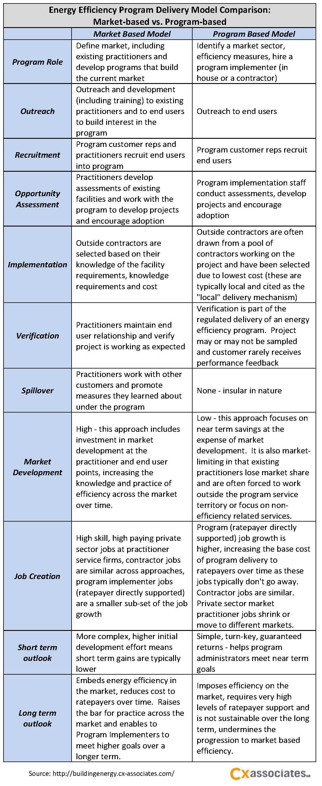
As an engineer myself, I was struck recently by fresh evidence of the pervasive challenge of communicating technical information effectively. I attended a building conference where the focus is designing better buildings and one common thread emerged. “Death by PowerPoint” is alive and well in the building and design industry.
Common Communication Problems
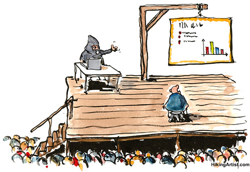
All the 1-1/2 hour presentations I attended were in “PowerPoint” format…you know, click on the button, the slide changes, the presenter talks about the slide, he or she clicks again and…well, you get it. They all had solid technical content and a high level of applicability to my job. Four out of those five, however, had fair to poor presentations. The slides were either not engaging, way too busy (also known as chartjunk), illegible (because the fonts were so small) or served simply as the presenter’s script. Couple that with a dimly lit room and inadequate ventilation (we WERE in a hotel, after all) and you can imagine what ensues.
Pervasive Communication Problem
I’ve had the same feeling every year I attended this particular conference over the last 5 years, and I can remember only a handful of effective presentations at national conferences over the years. Now I’m no presentation guru, but neither am I a sommelier — yet I know when a wine tastes good, and I know when a presentation misses the mark. If, as an industry, we are going to advance building performance, energy efficiency and sustainability, we need to communicate more effectively with each other — as well as non-technical audiences.
12 Presentation Tips for an Engineer from an Engineer
- DON’T - READ YOUR SLIDES! Oh, sorry, did I yell that? Well, I meant to. I read aloud to my 4 year old because he can’t do it himself yet; I can. Use your slides as talking points, perhaps to compare a few things with a graph, or to highlight the main points you want to cover.
- DO – Prepare notes from which to speak that only exist in your hand. This will let you look away from the slide and engage with your audience.
- DON’T – Put up a slide that’s simply a white background and black text. C’mon folks, Power Point has dozens of canned templates that, if nothing else, add a splash of color or some texture. Additional time = 2 minutes. If that’s a little too much to do, use some other font than Times New Roman and make the text a different color. Something…anything!
- DO – Use photos or sketches to describe your talking points. We all like picture books whether we want to admit it or not…same thing applies to presentations. Photos are great ‘cause they’re real. Every presentation I’ve attended that uses photos always seems to keep the audience’s attention.
- DO – Use graphs. All the folks at this conference have the technical aptitude to understand a graph. Graphs are a simple way to compare A to B to C and they can add a splash of color.
- DON’T – Use graphs that have so many data points and compare so many things that looking at them starts to make me say “whoa man, what’d they put in that lunch buffet?”.
- DO – Use graphs to illustrate a point by summarizing or showing an indicative section of the data. Keep the font legible and the number of data points to a minimum.
- DON’T – Show me a screenshot of the ENTIRE SPREADSHEET you used to perform a complicated analysis or to compare umpteen options and then start by saying “this isn’t meant to be legible”. No kidding?!
- DO – Show me a section of that spreadsheet and summarize the headings on the top and side. You’re giving me an idea of what you did, not presenting the detail of the findings.
- DON’T – Stand behind the table or podium if you can at all help it. I know, public speaking is not a strong point for many people and that’s perfectly acceptable. Just step around the physical barrier that is between you and your audience. I don’t expect you to be that person who walks around the room and gets to know half the audience, but removing the barrier is another step to keeping my attention.
- DO – Look the audience in the eye. If you can’t do this, which is understandable, look at their hair. I learned that somewhere and you know what, it works. You can do an entire presentation without making any eye contact and still convince the audience you were looking at them.
- DO – Practice your presentation and get your colleagues’ input ahead of time. We’re all busy, believe me I know. But I paid to attend this conference and I expect a little more than a presenter who stumbles though their presentation because they weren’t familiar with the content of the slides. Yes, that happened. He even said “sorry, I’m not totally familiar with this presentation.” Folks – he was the guy the program listed; it wasn’t a surprise to him he was presenting.
So that’s my 2 cents on what these presenters could have done better to engage me which, I assume, is what would engage you or most anyone else. What’s your favorite tip (or resource) for more effective presentations?
Resources
PowerPoint Does Rocket Science--and Better Techniques for Technical Reports (Edward Tufte)
Harvard Business Reveiw Guide to Persuasive Presentations - Nancy Duarte
Mastering Prezi for Business Presentations – Anderson-Williams Russell