Introduction
The graphical interfaces that connect building operators to the HVAC, lighting, power management, security, and other systems are critical elements of a building control system (A.K.A. BMS, DDC, EMS, but for the purposes of this post, we will focus on the “graphics” portion of the controls server, independent of what the control server is called colloquially). The graphical interface provides the building operators quick access to many pieces of useful (and sometimes critical) information which supports building operation. These include, for example, system status readings, alarms, sensor readings, damper/valve positions, fan/pump speeds, and energy performance metrics. The graphics also provide a means for operators to change setpoints, adjust alarm limits, enable/disable equipment, and do many other functions throughout a potentially large building or campus, right from their desk or a control system workstation.
Despite the fact that the graphics are such an important tool for the building owner over the life of the building, the graphics are often the last work to be completed by the controls contractors. Controls contractors mostly work one “level” below the graphics—in a less end-user friendly, but more powerful control logic/programming interface. This works very well for the purposes of implementing the functionality of the control system; however it is not a very intuitive interface for end-users. The graphics “layer” is then set up on top of the background programming, and is linked down to certain variables, inputs, outputs, etc., that are determined to be “important” for the operators to have access to. The graphics portion of the controls work, while sometimes explicitly defined in the control system submittal (but not always), is almost never completed in a manner which a) doesn’t have errors, and b) is complete and provides the necessary and intuitively accessed resources for the operators.
One structural problem with the completion of good graphics is that they almost always get completed at the end of the job. Depending on the specific case, the controls contractor may be out of fee on the job, or may be under pressure to move onto the next job, etc. The result can be that control system graphics can end up very lacking in attention to detail—leaving building owners to struggle for years with even the basics of manipulating the interface. This is why as a commissioning authority (CxA), conducting a thorough review of the final system graphics is a critical portion of any job that involves graphical controls.
There are two major areas where graphics fail their end users: the completeness/accuracy of the graphics, and issues around clear and intuitive design.
Completeness and Accuracy
Graphical interfaces for control systems nearly always have some errors, omitted values, incorrect units, and the like. With good controls contractors, these are usually minor, and the issues often get caught in their own quality control process or during functional testing. Others are less successful at delivering an error-free interface, and what is sometimes attempted to be turned over to the owner is occasionally unbelievable. Below are some examples of common errors and omissions in graphics, from a handful of recent projects:
Omitted Units
The zone temp/humidity sensor in the excerpt from an air handler graphics page (below) is missing degrees F and relative humidity %. While it is relatively easy to guess what these units are, other variables are sometimes more difficult. Every displayed value on graphics should have units associated with it. A new operator should be able to read the graphics, and not have to ask what the “standard” units are.
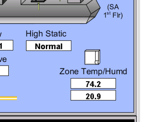 This graphic lacks units.
Missing Values
Sometimes graphics have values which are totally missing. The example below comes from graphics that the controls contractor had called “finished” and attempted to turn over to the owner. The points may have been removed from the project, but if they were, the graphics should no longer appear—the system should represent the final project and have valid values for all sensors/status/etc.
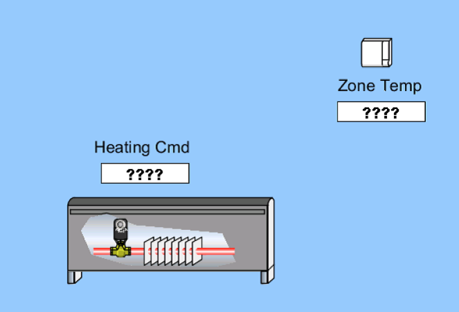 Missing values
Other Issues
A wide range of issues can arise with graphics, and the bottom line is that they require a thorough review by the controls contractor, followed by the CxA, and ultimately, by the building operations staff. The following, while not technically “wrong” is another example of an inadequate review. We suspect that the current sensor for the fan in the graphics excerpt below is not actually capable to metering current to 42 decimal places, and instead should be limited to tenths of an amp. In this case, it would then read “0.0 A”.
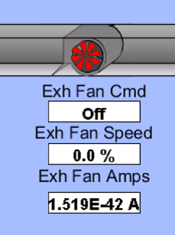 Fan Amperage Accuracy
Clarity and Intuitive Design
Good graphics should be intuitive. They should be designed in such a way that they provide enough detail that a new operator with limited familiarity with the building can find their way to most essential functions. They should also have visual aides to assist users in getting a quick overview of a system by just glancing at a page. Some examples of design that is less intuitive and clear are below.
Animations
As much as possible, equipment that has status feedback should have its status animated. Valves, pumps, fans, boilers, dampers, and other equipment should show either through active animation or color change what it is doing. Below are two examples of pump sets—one with animation, and one without. Which one provides more information to you?
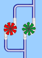 Animated pump graphic
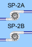 Non-animated pump graphic
Clarity In Presentation
It should also be straightforward what is being presented. In the following floor plan of terminal VAV units and heat pumps, the room numbers are the only indications of what space is what. There is no north arrow, no “hallway” labels, no “restrooms” labeled or any other way of knowing what is what without knowing the room numbers. In this case, the owner may want to not commit names to spaces for the purposes of future flexibility—and that is reasonable. However if this is the case, additional effort should be made to label more permanent spaces or provide other cues that help the user orient themselves.
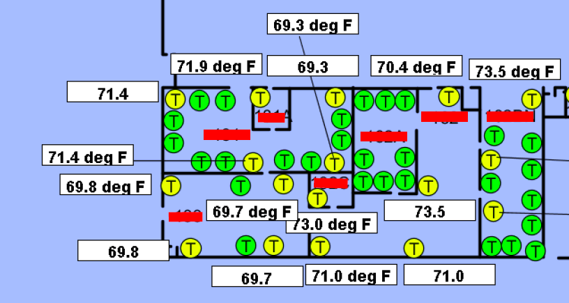 Terminal Unit and Space Temp Map lacks space labels
Conclusion
In this blog post we’ve only looked at a few ways in which controls graphics can be problematic. In our work, we have encountered many, many examples of both graphics designed very badly, but also some really good graphics developed by dedicated controls contractors. The bottom line is that as a building owner, before the project is accepted, it’s a very good idea to make sure your commissioning agent and operations staff conduct a thorough review the graphics that you’ll be living with for the next 15-20 years.